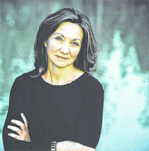
Pemi Aguda is a Nigerian author whose writing beautifully blends contemporary realism with the supernatural. Her debut short story collection, Ghostroots, was a 2024 National Book Award finalist and offers a hauntingly imaginative look at family inheritance and the uncanny. A two-time O. Henry Prize winner, she continues to captivate readers with her evocative storytelling and her debut novel, One Leg on Earth, published in May 2026. She discussed the novel and its covers’ design in an interview with Brittle Paper. You may find the interview here:
Brittle Paper:
We’re so glad to have you, Pemi. We want to talk covers, specifically yours, which have become something of a phenomenon in themselves. So we’ll be asking you about your creative process, your relationship with your designers, and your broader thoughts on what covers do for books and for readers in today’s visual landscape. You’ve now done this twice, three covers for Ghostroots, three for the new book. At this point it feels like a signature move. What is it about having three covers that appeals to you? What goes into deciding how each one should be different from the others? Do they each speak to a different aspect of the book, a different kind of reader, or something else entirely?
Pemi Aguda:
Alas, it is less exciting than that. It’s a publishing decision. My publishers in Nigeria, the UK and USA have different markets and, so far, have thought that a different cover would suit their readerships better. I’m not mad about it; I get to enjoy the distinctions, to see what the different designers pick up on in the stories.
Brittle Paper:
How involved are you in the actual creative process of designing the covers? Are you coming in with references, moods, images you love or do you hand over the brief and respond to what the designers bring back?
Pemi Aguda:
I try to be as involved as they’ll let me! I feel very strongly about book covers and font types. I learned from my friend Gerardo Sámano Córdova to arrive prepared. I typically submit a deck that includes art styles, moods and other book covers that I think could be good inspiration for mine, as well as trends or styles that I would prefer they avoid. I include artists whose work I perceive to be in conversation with the story. I really wanted these covers to be both unsettling and vibrant—two words I might use to describe One Leg on Earth—and I think they are all very successful.
For the US cover of One Leg on Earth, an artist friend, Nengi Omuku, introduced me to the work of Calida Rawles, and when I saw the movement of “Away with the Tides,” I could imagine that foot belonging to Yosoye, the main character of the novel, and so I presented it to the design team. There’s something sensual in the curve of the water, but eerie in the shadow it casts on the white blank space.
As for the Nigerian cover, Bunmi Agusto came on my radar a couple of years ago and I knew that one day, I would love her work to live on one of my books. I love thinking of it as a kind of spiritual collaboration. In this detail of “Chasing Spirits,” I was drawn to the woman swimming/flying/escaping. The braided hands reaching for her felt both connected to Ghostroots and the grasps that the protagonist is trying to escape in One Leg on Earth. The realistic hand shooting out from the dark is a startling component, striking against the green and graphite-coloured images… is it a drowning hand?
I immediately loved the spookiness of the darkened hand in water contrasting with the bright pink and yellow sun of the UK cover. The hand almost has walking movement. Most of our conversations were around the right font. It also calls back to Virago’s paperback cover of Ghostroots, with Chioma Ebinama’s hand image.
Brittle Paper:
From everything you’ve observed, what role does a cover actually play in how a book is received? Not just in terms of sales, but in how it shapes the conversation around the book, the kind of readers it attracts, the way it gets reviewed and discussed?
Pemi Aguda:
I can’t speak authoritatively about sales. I do think that because a cover is the first interaction a reader has with the story, it should successfully evoke a feeling and mood that aligns with the book’s content. I have picked many books up because I was drawn to the cover. I had many people tell me that they gave Ghostroots a chance because of Day Brièrre’s arresting art and Sarahmay Wilkinson’s unique type design.
Brittle Paper:
As an author, how do you know when a cover is ready?
Pemi Aguda:
It’s ready when the publishers say it’s ready. Much like my fiction, I could keep tweaking and editing till kingdom come, but they are the professionals with schedules, and eventually I have to release my grip.
Brittle Paper:
Are there publishers or designers you feel are genuinely raising the bar?
Pemi Aguda:
I adore minimalist but striking covers and New Directions does those well. And many FSG covers are hits for me, too!
Brittle Paper:
Thank you for your time, and we are excited for this new release.
That’s all for today. See you in the next edition of author interviews.